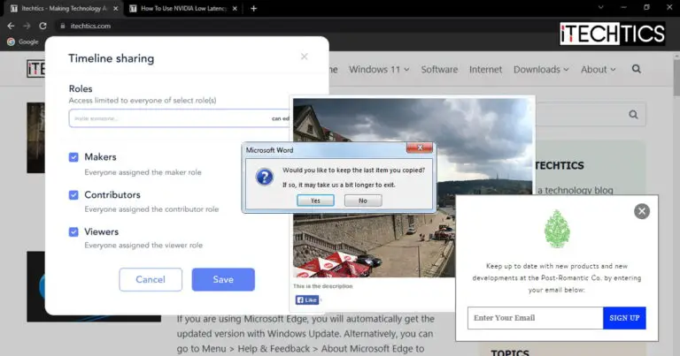
The Windows operating system as well as most websites use different modes to grab your attention, show you content, and make it mandatory to pick an action using different kinds of content that pops up.
For example, if you visit a website with ads and your ad-blocker is enabled, you are prompted to turn it off or have the option to “continue without supporting.” Without pressing a button, you cannot continue. These are called popups with “callback” action.
Another example is when a dialog box appears in a new window on the Windows OS asking you to confirm an action, or prompting you of something. However, this window can easily go in the background without you noticing it.
These are just two examples of the different types of windows and snippets you encounter on a daily basis. There are also other kinds.
In this article, we discuss the many variants of windows, popups, tabs, etc., how they differentiate from one another, and which one you ought to use according to certain requirements and expectations.
Table of Contents
What are Modals, Pop-Ups, Popovers, Lightboxes, Windows, Tabs, And Dialog Boxs
Pop Ups
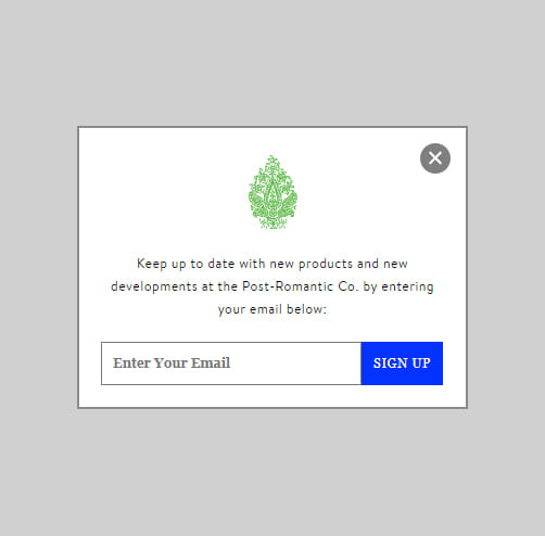
Pop Ups are both a common noun and a proper noun. It also refers to a specific type of pop-up, and can also be used for windows that pop in front of you out of nowhere on the screen.
Right now, we are discussing the Pop Up that usually appears on a website. It usually contains marketing material and ads that the user did not initiate. These are not limited to ads only.
A Pop Up occasionally also contains a newsletter subscription call to action, sign-up call to action, discount deals, etc. These often appear automatically on a landing page as soon as the page loads.
That said, Pop Ups open in a separate window and can easily go in the background if you click another window. Additionally, they usually do not blur the background and can be easily dismissed by closing them.
A Pop Up usually contains information for your knowledge, and may or may not include a call to action. This is usually dependent on the developer.
Pop Ups have been widely overtaken by modals due to their distracting nature that defocuses the user/clients.
Modals
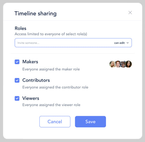
Modals are often confused with Pop Ups but are different. Modals open within the same window and therefore become the primary focus for the user.
These are usually designed by the web developer, therefore mostly have the same theme as the website. Additionally, a Modal blurs the background so that the user can focus on the content in front of them inside the Modal.
Modals are usually initiated by the users and include workflows. For example, Modals can be used to select categories, apply new settings, and do anything that needs the undivided attention of the user.
We would also like to add that Modals are slowly replacing Pop Ups. Many websites have started using Modals instead of Pop Ups as they are more in tune with the website’s UI, open inside the same window, and get a user’s attention.
This means that Modals now also include similar content to Pop Ups, like sign-in and subscription call-to-action buttons.
Lightbox/Theatre

The words “Lightbox” and “Theatre” occasionally g hand-in-hand, as they are the same thing.
A Lightbox is an enlarged image a user clicks to view in detail. For example, if you click on an image on a website with many different, smaller images, the clicked item enlarges within the same window. This is a Lightbox.
A Lightbox has different purposes as opposed to a Pop Up and a Modal. These are only used for digital content, like images and videos, to increase its size and enhance visibility.
Popover

A Popover is a miniature pop-up that appears on top of another object. For example, when you install Microsoft Edge for the first time, you may see guidelines and tutorials highlighting certain sections of the browser, and tell you what that button/content can be used for.
Popovers are usually used to direct a user on how to use something, or show more information regarding another object.
Window

The “window” we are referring to is not the Windows operating system, but a common noun. Every app, program, browser, etc. has a window it opens in.
A window is a frame in which any content appears. For example, when you open a browser or File Explorer for the first time, a new window appears where the user can interact with the content inside.
You may understand the difference between a window and a tab a little better after reading the tab section below.
Tab

A tab is more or less like a new page inside an existing window. The best way to understand the concept of tabs would be to look at your web browser.
If you click a link on a non-browser window, it will open inside your default browser, probably in a new window if the browser was initially closed. However, if you click on another link, it will probably open in a new tab inside the existing browser window.
You can switch between different tabs inside the same window from the top, and each of those tabs can independently handle different URLs/Locations. Additionally, File Explorer now also supports tabs so you can access different directories within the same window. Moreover, Microsoft has also incorporated the tabbed system on the command lines, like the Command Prompt.
This shows us that the tabbed system may be the future of quick multitasking across all apps and programs.
Dialog Box

A dialog box is mostly used for operating systems and not web browsers and apps. It is a prompt to intimate the user about something and may or may not include any actionable content.
For example, you may be asked to choose from an option whether to “restart now” or “restart later.” Or, you may only see some information, like an error code, or a prompt, inside a dialog box, and are only able to close it.
That said, Dialog Box is a kind of pop up therefore easily interlinked, and can also be a form of “Alert” requiring immediate action from the user.
Modal, Pop-Up, Popover, Lightbox, Window, Tab, Dialog Box: Which One To Use
Now that you understand what each of the aforementioned pop up is and how they can be differentiated, it is entirely up to you which one to use according to your needs and requirements.
Mainly, users become confused between a Pop Up and a Modal, since both of them can contain similar information. This confusion normally arises between website developers as this is where both of them are used frequently.
As we mentioned before, Pop Ups are becoming obsolete as they are more distracting, themes can be somewhat different from the website, and divert the user’s focus. Whereas a Modal blurs the background within the same window, automatically requiring the user to make an action, like subscribing to a newsletter.
Apart from these two, you can use a Pop Up or a dialog box when it does not need the immediate attention of the user and can afford to go in the background. Of course, a Pop Up is not recommended when the user wants to preview an image. For those purposes, a Lightbox would be ideal so that the user is not distracted and remains on the same window/tab.
Closing Thoughts
Every window, small or large, serves a different purpose. The type of pop-up that you see entirely depends on what it is used for, and where it is used. Therefore, you ought to put some thought into what kind of pop-up you want to use for your website development.
Also, we would like to remind our readers that the blurriness/opacity of the background, while the pop-up is visible, is also a huge part of the experience. This is known as the “Balsamiq” and is usually a layer of greyish tone, or simply blurs the content behind it.

